A restauranteur with a taste for a new project
We had been working with our client, Stephen Fitzpatrick, for a number of years and had created marketing materials for his two restaurants.
Stephen later decided to sell one of those restaurants and purchase The George, a former 16th-century inn in South Leicestershire. His intention was to refurbish the property and reopen it as a contemporary British restaurant, bar and boutique hotel.
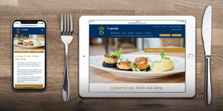
The building needed a complete overhaul, with major building work throughout and a new interior design scheme. This would be complemented by a new visual brand and WordPress website and, for this, Stephen requested our services once again.
An ambitious renovation
The George had previously been run as a pub with three letting rooms. It had a good reputation for reasonably priced food, but was known for serving pub Thai dishes and curries rather than quality British cuisine.
When our client purchased the property, he had a clear vision that could only be achieved by making substantial changes. This involved a total refit of the ground floor restaurant and bar area, and the first floor accommodation.
The restaurant was extended to the rear, with bi-folding doors that opened onto a large patio and landscaped garden. And the accommodation was upgraded to an eight-room boutique hotel.
The new open-plan restaurant was to serve contemporary British cuisine made with locally-sourced produce. And there would be a traditional village bar area for relaxed drinking and socialising.
To accompany our client’s ambitious plans, the establishment needed a whole new identity that would signal the change of ownership and mark the significant change in direction. The branding needed to match the quality and style of the refit.
Contemporary branding with a traditional twist
The original outdoor sign was typical for a traditional British pub. It used a classic typeface and an illustration of King George.
The new branding needed to be much more modern, but with an acknowledgement of the establishment’s former heritage.
We created a series of statements to give the branding a clear direction. Our statements talked about creating a sense of being relaxed, informal and comfortable. And following a style that was contemporary and eclectic, with a traditional twist.
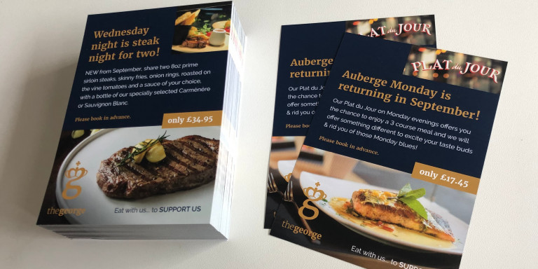
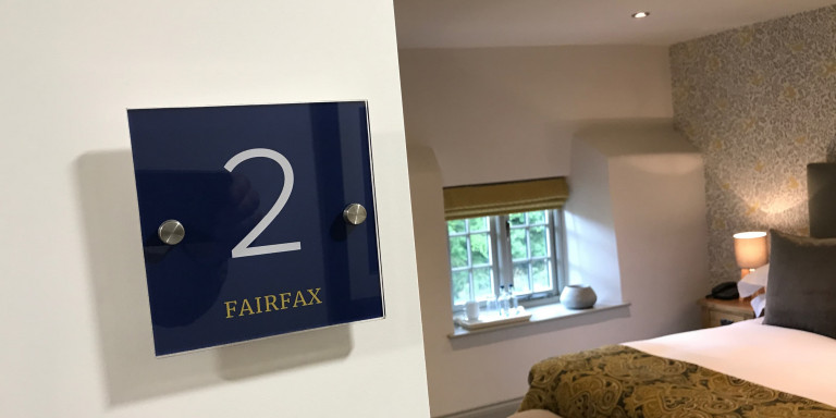
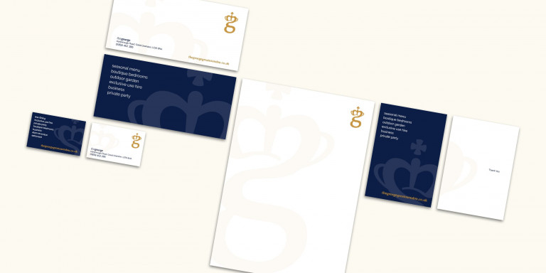
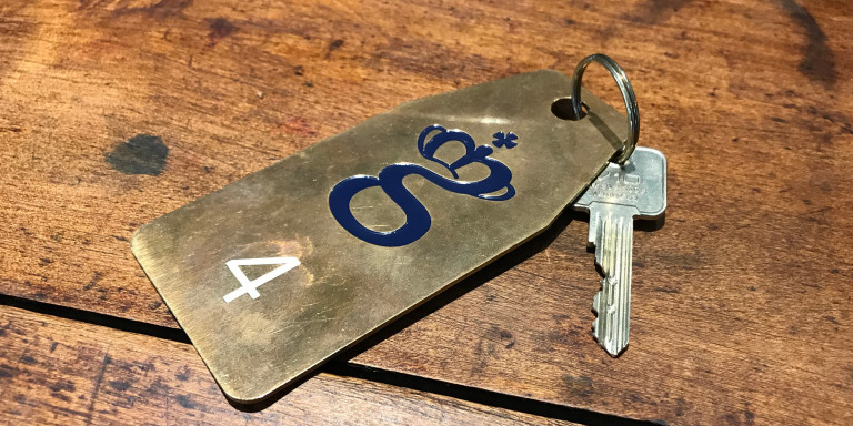
Designeering approached the branding with an initial research stage, to see what other, similar restaurants were doing. We looked at the various items that the refurbished George might need. These included signage, room key tags, bedding cards, table menus, stationery and even bespoke wine labels.
This was followed by the brand development stage, where we created a series of logos and branding concepts. We showed how the branding could be implemented across each of the items from the research.


